Web Design - Evolution
Introduction hideshow
I began building web pages in 1995 as a way to jump into the geek world of programming; HTML was the new rage (Netscape had just hit the scene) and none of my programmer friends knew this new language yet. I started simply: viewing the source on netscape.com, yahoo.com, and a few other sites; cribbing HTML code; and then testing variations to see what the code actually did. I kept notes on behavior, and RGB values for colors, in a notebook. Eventually I found tutorials, and finally landed on W3C.org where I would, in later years, be a frequent visitor to the official documentation on (X)HTML, CSS, and the DOM.
The early designs, running on university servers, are rather garish, though they were not particularly outlandish at the time. The web development industry really took off in the last few years of the '90s, and ordinary programmer wannabes like me finally started to learn some design principles, usually by osmosis.
In recent years, my time has been committed to other endeavors, with very little web development. Three organizational websites I managed were closed down, and this site's design remained stable from 2008 through 2011. In the autumn of 2011, the old yearning kicked in, and I decided it was time to update the site's design: keep the principle elements in place, but improve the navigation, widen the content area (particularly needed in the Tech Blog), and integrate a few nice UI-touches with jQuery. Older versions of the site had some hand-crafted DOM manipulation. It was fun to learn how to use JavaScript to work with the DOM. Nevertheless, the time has come to rely on a professional, well-tested toolset.
Timeline
Use the slider to change the year; currently displaying
In the beginning…
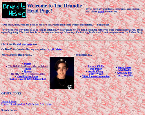
"drundle head" was an inside joke.
The background was lovingly handcrafted in Photoshop 3.0. "Peppermint" I called it, and I sure was proud of it. In 1995 anyway :-).
Sum total of other people I knew with web sites of any kind.
A bit less garish…
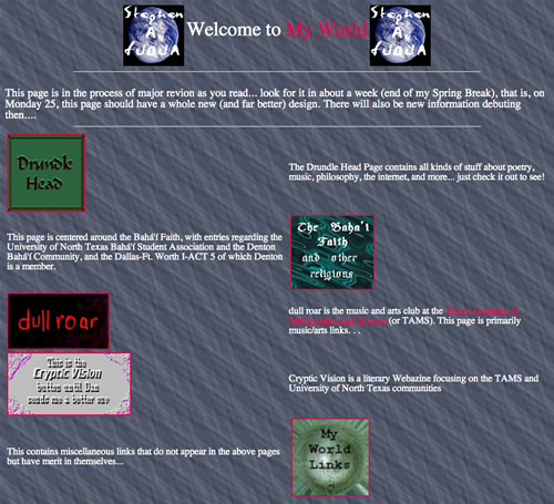
I wonder how many sites had the name "My World"?
The emboss filter in Photoshop was very popular back then.
More fun with Photoshop filters. I believe each image herein was hand-crafted (not borrowed from another site, as was the popular thing to do).
A solid background!
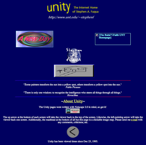
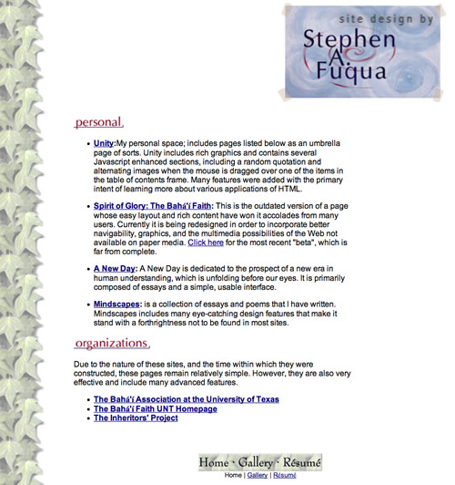
"Unity" is a motif that I was cultivating across the various essays, poems, and other material posted in my site.
I didn not back up my work very well. In fact, this screenshot came from the Wayback Machine.
Internet Explorer was not yet a competitor, so apparently I put this in here because of the use of Netscape 2.0's new HTML extensions.
Introduction of frames…
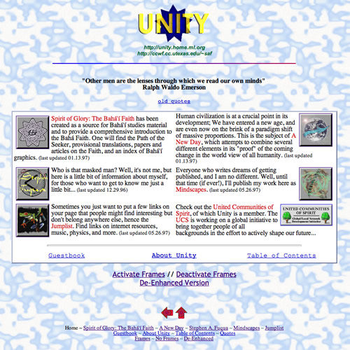
Starting to see some more sophistication in the design… well, a bit.
These buttons were fun to create!
This shot does not show the frames. As with many other designers, I quickly abandoned the use of frames.
Getting more professional…
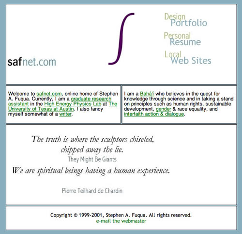
A quantum leap in design.
Still one of the most interesting pieces of Photoshoping I've done.
Spirit of Glory was once among the largest collections of original content on the Bahá'í Faith.
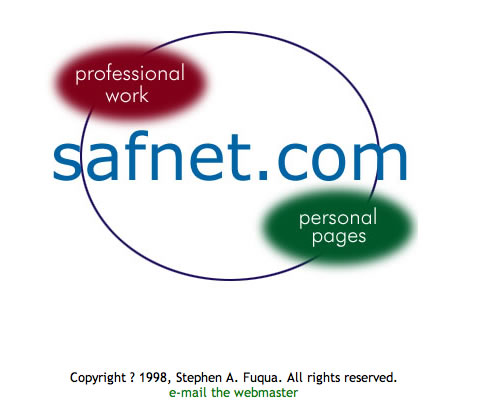
Launch of safnet.com
1998 brought my first paid-for sites, for Quick-to-Fix Foods, Inc. and Fuqua & Eyre, Inc.
Unfortunately I cannot find any inner pages from this era.
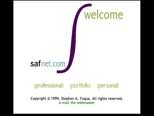
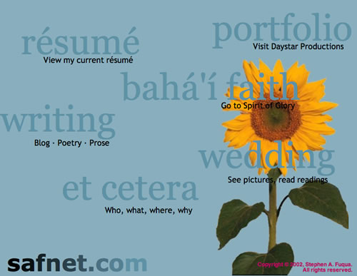
I was going for "simple but elegant"…
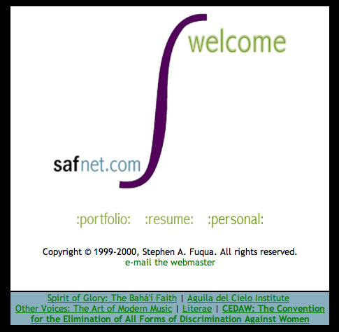
Much better than 1998.
These were my first link "rollovers" (in JavaScript).
Minor update…
Reducing the number of clicks to inner content.
Fun with CSS…
First complex CSS-only, table-free design.
Continuing the movement to bring meaningful content back to the front page.
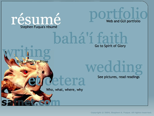
Getting creative with CSS…
My most artistic presentation yet. No rollovers, back to no content, just links to inner pages.
Gradient effect on plain text (not an image) achieved by simply changing the color for each letter.
First attempt (successful!) at cropping out an image background in Photoshop.
Refining the theme…
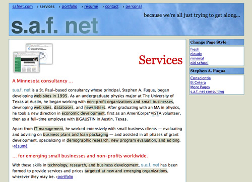
Less artistry, more salesmanship…
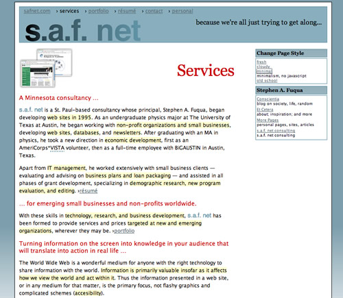
Whilst job-hunting after moving to Minnesota, I felt the need to bring content front and center.
I employed a simple Javascript stylesheet switcher to show the page's design versatility. See the 2005 and 2005 redesigns for later styles applied to the same HTML.
This site was serviceable and good looking, but not very inspiring.
Same HTML, different stylesheet…
This stylesheet brought much-needed vivacity to the site, though I still found it rather boring to look at.
Same HTML, yet another stylesheet…
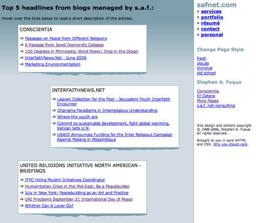
This design did not bring any more life to the site, but did prove the versatility of a pure CSS layout: except for the content itself (RSS headlines from 3 blogs), the HTML was unchanged from the previous two versions.
Green!

Self portrait.
Lilly from the front yard.
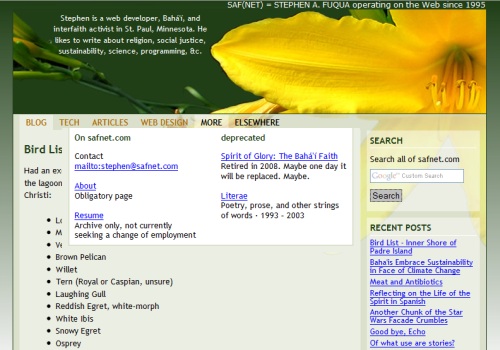
A bold leap ahead from 2004, at least for me. Not many opportunities for exercising web design creativity in 2007, so this was a fun exercise.
Blogging front-and-center…
Same lilly, but now in close-up.
This time, it is all about the content - moved blog from 3rd party site.
Simple tab design; MORE and ELSEWHERE expand with additional content.